At the recently concluded Google I/O developer conference, the Pixel 6a, Pixel Buds Pro and other new hardware products sparked the emotions of the audience, while stealing the attention of the original protagonist of the conference - the software.
But that doesn't mean the software and Android OS announced at the developer conference are worthless - they're improving our experience with our phones in more subtle ways.
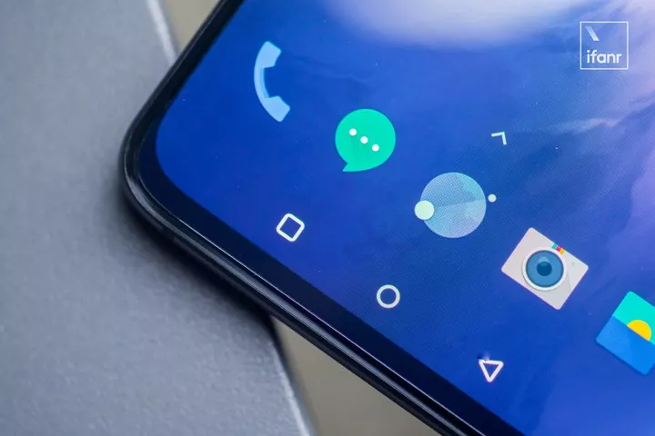
▲ Used to using gesture back, do you remember the virtual back button?
For example, Google announced at its developer conference that it was modifying Android's gesture back feature to make the 'back button' work better.
The App is so messy, Google is coming down on the scene itself
It's already 2022, why does Google want to change the Android back button?
Doesn't it work fine, why did you change it?
Perhaps you have similar questions, but the best answer is the fact that the Android back button is not that difficult to use, the problem is the apps that abuse the "back" function.
Since the Android back button supports global operations and can be used to return directly to the desktop, such as WeChat, Weibo and the system's built-in applications are able to return directly to the desktop in one swipe.
If you switch to apps like Baidu Maps or B Site, you need to swipe sideways 2 times to return to the desktop. Today's headlines even directly make the back button a "refresh" button, so swiping sideways on the app's home page is not to quit the app or hang it in the background, but to refresh the stream.
In addition to easier operation, Today's Headlines has enabled the "back button to replace refresh function" by default, perhaps with the purpose of enticing people to stay in the app to watch content by refreshing with new content.
▲ Slide once to return to the desktop and slide twice to return to the desktop
The original side-swipe twice to return to the desktop feature is designed to prevent accidental touch, in landscape gaming scenarios, fingers often operate inevitably touch the small horizontal bar interaction area at the bottom of the phone by mistake to trigger the return function, two return verification is a good solution to this problem.
It's just that a large number of apps now use this mechanism, making it difficult to tell exactly which apps need to be side-swiped twice to return to the desktop and which apps can be side-swiped once, and there aren't really that many apps that need to be mistake-proofed by the side-swipe feature twice.
When the return key destination is uncertain, the more confusing it is for people to operate.
On the other hand, apps are getting richer in features and content, and the app homepage even has dozens of secondary menus, but secondary menus cannot be increased indefinitely, and going to new menu levels all the time is not only inefficient to operate, but also a bad experience.
So both horizontal and vertical operations are being looked at by major app developers, for example in Today's headlines you can swipe left and right to switch content sections, and in some e-commerce apps there are even dedicated cards that swipe left and right to switch content.
Compared to physical buttons, gesture operation is obviously more complex and difficult to understand, and the trigger range, swipe length, etc. of gesture swipes can affect the use of the function.

▲ Swipe to switch content cards in the app may conflict with the swipe back gesture.
These apps include the ability to swipe left and right to switch content, all to some extent and the system side swipe back function to form a 'conflict', side swipe is swipe the content in the card, or trigger the return action?
Google's latest approach is to introduce "predictable design", not only does the normal swipe back have a corresponding arrow symbol to prompt people, but when swiping back to the desktop it will directly display the desktop wallpaper, with a clear interface animation to prompt people where the back button will take them, reducing the number of cases of inadvertent app closure.
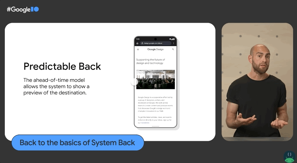
▲ New Back gesture. Image from: Google I/O
With the popularity of full screens and the absence of physical buttons, intuitive and obvious animations and symbolic cues are a better solution.
As per Google's announcement at I/O, the new Back feature has been tested in Android 13 and will not be the default setting until Android 14.
Fragmentation of the Android experience
In fact, Google has been "tossing and turning" the back button for a very long time, starting as early as the button smartphone era, and various experience fragmentation problems have not been completely solved to this day.
Initially, Google set 2 definitions for the Back button, Up and Back, the former referring to returning to the previous information level and the latter to return directly to the end of the current activity, a more intuitive example being the Back button on the search interface and the phone's side-swipe to return.
When you swipe sideways to return, the phone will first retract the keyboard bar and you need to swipe sideways again to return to the original interface, whereas pressing the back button directly next to the search bar will return you directly to the original interface.
▲ Take the back button of the search bar as an example to return and go back to the previous information level .
The back button next to the search bar performs a return to the previous information level, while the phone's side swipe triggers an end to the input activity.
Unfortunately this design has not been fully popular and not every developer can design applications to the appropriate standard.
As phone screens get larger, it's becoming increasingly cumbersome to tap the back button at the top of the phone with one hand, so many apps have simply removed the back button from their interface and rely on Android-level global side-swipe back functionality.
It is common for app developers to copy the interface design of the iOS version of their apps, resulting in a poor experience.
Originally, Google's design language for Android, Material Design, made the side left swipe to call out the side menu bar, but a large number of developers did not support this design eventually led to the bankruptcy of the design, the side swipe call out menu completely gave way to the back function.
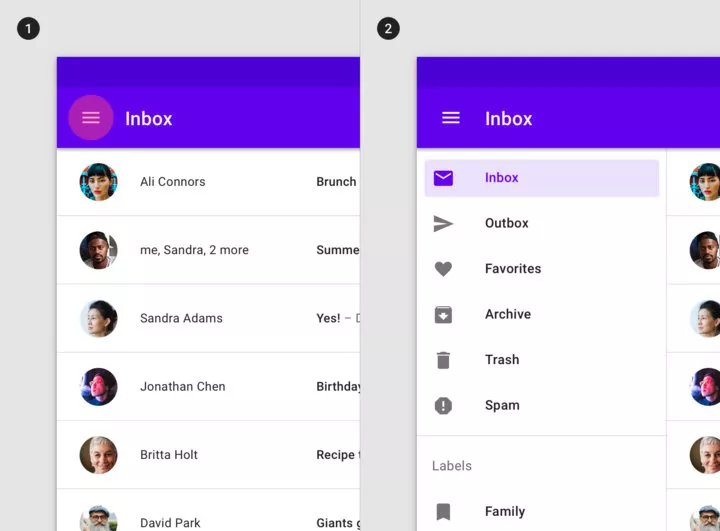
▲ Many apps have abandoned the side-swipe call-out app menu
WeChat Android version does not support side-swipe to call out the "article floating window" function, while the iOS version supports this feature, which is apparently one of the effects of the Android side-swipe back function, many Chinese mobile phone manufacturers also add "innovation" to the return button, side-swipe stay will call out the new application menu.
The iOS version of WeChat supports dragging and dropping to bring up the "article floating window", while the Android version does not.
Google is a latecomer to full-screen and gesture interaction. Xiaomi implemented a full-screen design on the initial MIX, completely abandoning Android's three physical buttons and replacing them with virtual ones, followed by an increasing variety of full-screen models and technical directions.
After the full-screen trend, phone makers with custom Android systems have reached out to the bottom of the system to try to define full-screen interactions. Xiaomi has fixed the back button and home button directly into side-slide and bottom-up gestures, and Meizu can enable different functions with different side-slide depths when sliding sideways.
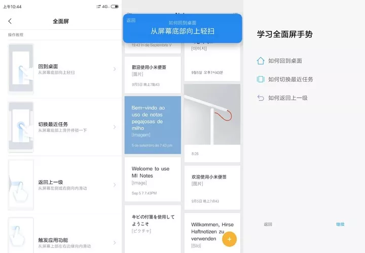
▲MIUI 10 side swipe screen in different positions will trigger different functions
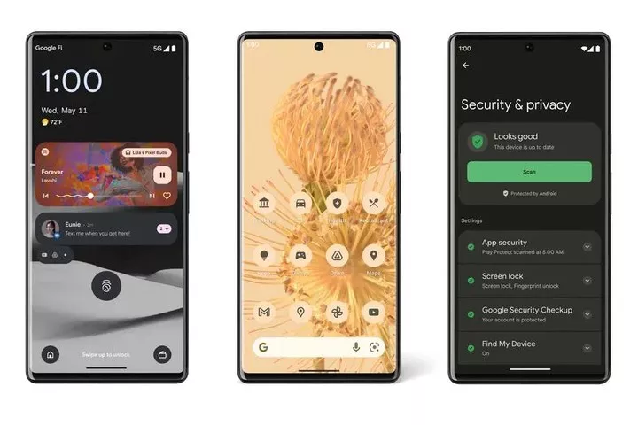
That's when Google, an afterthought, enabled full gestures in Android 10, being the one in control of Android, only to be upstaged by phone manufacturers in terms of the underlying interactions.
From this matter, you can get a glimpse of Google's control over the Android ecosystem, which is why when the new Android design and Material You were launched, many people said.
It looks good, but I sure can't use it.
How many app developers will support the fragmentation of Android that comes to mind as soon as they see the new design?
A good change is that Google is trying to solve this problem, external pull through chip vendors and mobile phone manufacturers, such as system upgrades through cooperation with Qualcomm to improve the phone system update cycle, OPPO, Samsung and other manufacturers have supported three years of Android system updates.
Material You is also promoting this design language by partnering with phone manufacturers like Samsung, and Android 13 now fully supports third-party apps to modify the Material You icon.
Internally, through more self-developed hardware products, we understand the nuances of the product experience, and really define a good experience with a combination of software and promote it as a standard.
A small but very important basic feature like the back button can be valued and changed with the Android update into each phone system.