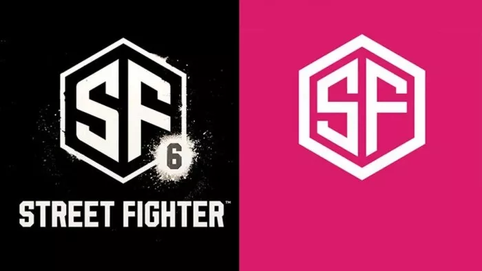
When Street Fighter 6 was first released at the beginning of this year, the most unimaginable part of the trailer was the logo of the game. It looked like it was put together casually. On the left of the figure below is the logo of street fighter 6 released in February, and on the right is the PS commercial material library. You can buy it for a little money.
Access:
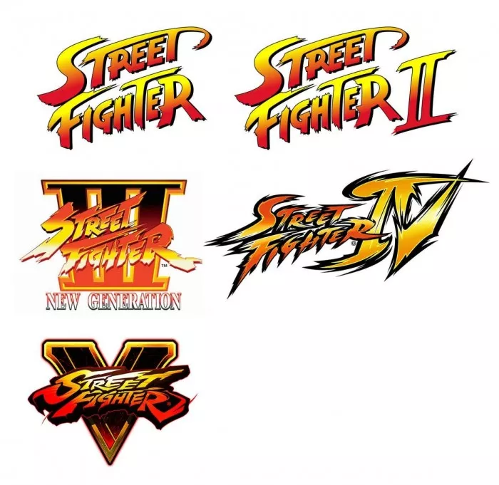
The problem is that the previous logos of the "Street Fighter" series are like this:
In the latest trailer of street fighter 6 released the day before yesterday, the previous cheap version of the logo was finally replaced with a slightly more like logo.
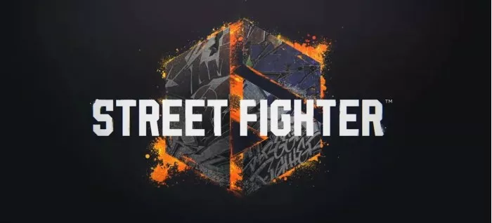
However, this latest logo is a little better than the previous one. It still maintains the previous hexagonal shape, and the text part is also preserved. It just puts the graphic part into a "6" shape. The design here is a little dim sum. You need to rotate it to see the shape of the Roman numeral VI.
However, even the latest version of the logo, compared with the previous version, still can not see that it is the same series of games.