After seeing some changes in the YouTube music app, users seem to be able to get another update on their appearance. In an Android screenshot leaked by a French reddit user with Galaxy Tab A7, the new design under test shows that the update focuses on the playlist user interface of the application, including the new button arrangement and the layout of music playlist information.
The current layout and design of the application is practical and tidy. However, in this era, aesthetics is also an important factor in promoting excellent user experience. This update is a pleasant change for YouTube applications. After all, now may be the best time for YouTube to show this new design change, because the appearance of the current application is a little outdated compared with other applications. The old design of YouTube playlists had an ordinary black background and large random play and play buttons. However, big improvements can be seen in the new design shared.
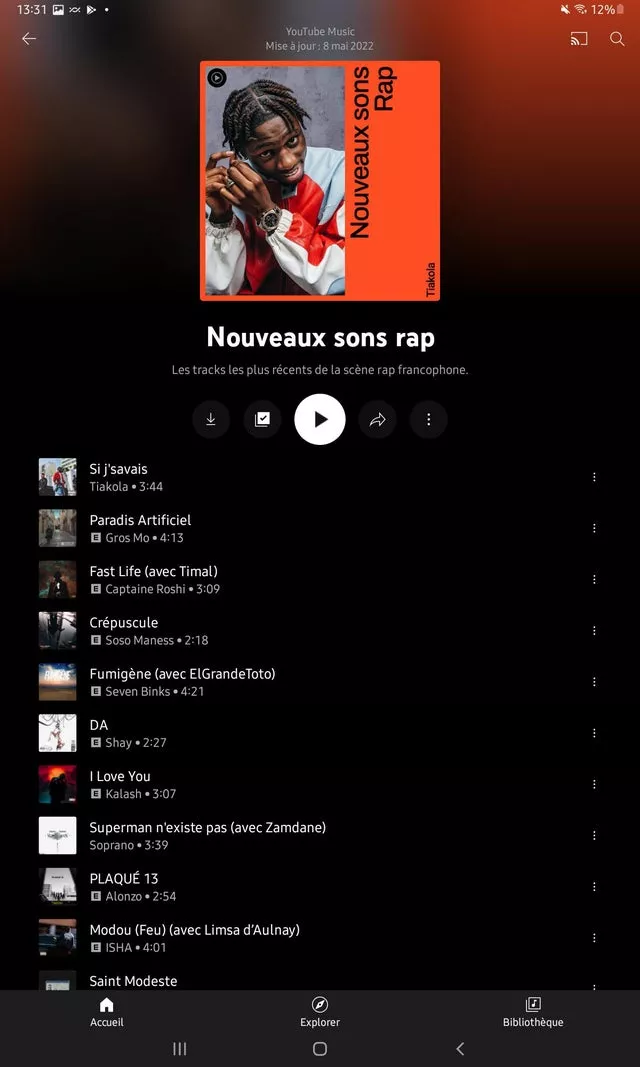
You can see that although the cover is still in the upper part of the screen, it is placed in a fairly prominent middle position. It consists of the musician image on the left side of the cover and the playlist name placed vertically on the right. At the top of the cover is the name of the artist and the last update date of the playlist. However, it is worth noting that the font size of the text of the above information is quite small. However, the name of the playlist is reiterated at the bottom of the cover, and its font is larger and described below. At the same time, the upper half of the background is a blurred image of the cover art, while the lower half is a neat black. The transition between the black part and the blurred image is very smooth, which makes the background look quite fashionable.
On the other hand, the buttons are arranged horizontally under the cover and its information. All are contained in circles, which makes them look more prominent and eye-catching. It is reported that this group of controls includes download, add to library, play, overflow menu and share button. The cast and search button remains at the top right of the screen. Surprisingly, the new playlist design does not show any random playback options or controls.
As for the song list, they are still at the bottom of the screen and have the same layout and information. They still have their own album art, title, song length, artist name and menu button (three vertical points) for each song.
Finally, some people believe that the new UI design will be applicable to community generated playlists and algorithm generated personal playlists. However, it is reported that the new UI design is only applicable to playlists and not albums, but in any case, users must hope that there will be significant changes before the final launch.